User Interface Improvement Suggestions
- Автор темы Go@
- Дата начала
EtaLasquera
Client
- Регистрация
- 02.01.2017
- Сообщения
- 527
- Благодарностей
- 113
- Баллы
- 43
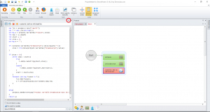
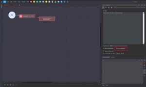
Add option to dock or hide browser from Window.
Sometimes we deploy in only one monitor and we have to do a lot of job with resize panels to hiding browser while coding.
The panel action proprieties auto dock himself when a double click in any block, this action sucks.
Sometimes we deploy in only one monitor and we have to do a lot of job with resize panels to hiding browser while coding.
The panel action proprieties auto dock himself when a double click in any block, this action sucks.
Вложения
-
116,9 КБ Просмотры: 638
-
144,9 КБ Просмотры: 677
Последнее редактирование:
EtaLasquera
Client
- Регистрация
- 02.01.2017
- Сообщения
- 527
- Благодарностей
- 113
- Баллы
- 43
Group tasks in task manager... As example, if my tasks have the same name and projects don't run in a sequential execution, as example I want to test login in fb, tw and gmail, there are three different task but all have the same name "Test login" because the action of three tasks have the same objective and these tasks don't run sequentialy, I want to do all at the same time.
If I put that tasks in the same group, the second task will start after the first task end and so on. If the task manager group tasks with the same name, the appearance will be more clean.
Another consideration is allow diferent setups for execution allowing tasks of same group to run at the same time and not only sequentialy.
Project maker UI
Arranging the panels is a pain in the ass. A 'default' arrangement of panels/windows, as well as some preset Workspaces would be good. Photoshop does this well.

Minimap in project maker
I think you should change the way mini-map works.
- Instead of being in a panel, the user should be able to toggle a full screen mini-map, click stuff, zoom in.
- minimap previews of code inside c# blocks
Arranging the panels is a pain in the ass. A 'default' arrangement of panels/windows, as well as some preset Workspaces would be good. Photoshop does this well.
Minimap in project maker
I think you should change the way mini-map works.
- Instead of being in a panel, the user should be able to toggle a full screen mini-map, click stuff, zoom in.
- minimap previews of code inside c# blocks
EtaLasquera
Client
- Регистрация
- 02.01.2017
- Сообщения
- 527
- Благодарностей
- 113
- Баллы
- 43
- Регистрация
- 19.01.2010
- Сообщения
- 958
- Благодарностей
- 742
- Баллы
- 93
It available in ProjectMaker 7:PM UI:
Allow select opened projects from a dropdown box instead current < left right > buttons.
Reason, sometimes we have more than 10 projects open and navigate between projects sucks.
More info about 7 version:
EtaLasquera
Client
- Регистрация
- 02.01.2017
- Сообщения
- 527
- Благодарностей
- 113
- Баллы
- 43
morpheus93
Client
- Регистрация
- 25.01.2012
- Сообщения
- 1 068
- Благодарностей
- 257
- Баллы
- 83
morpheus93
Client
- Регистрация
- 25.01.2012
- Сообщения
- 1 068
- Благодарностей
- 257
- Баллы
- 83
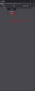
Also it would be nice to highlight all cubes where a specific variable is used or at least search for variables in the project from the variable window context menu.
Вложения
-
19 КБ Просмотры: 324
EtaLasquera
Client
- Регистрация
- 02.01.2017
- Сообщения
- 527
- Благодарностей
- 113
- Баллы
- 43
Allow us to resize SQL request text box like older zenno, or simple make it bigger.
ZP 7:
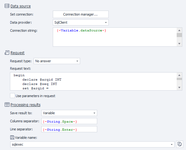
ZP 5.16
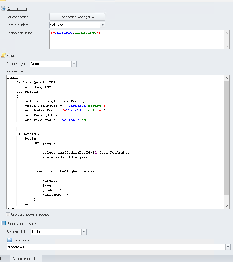
ZP 7:
ZP 5.16
